Simple UX wins
Oftentimes interacting with big data can be a challenge for users. Our team worked on improving existing user experience in key product areas. These new features offered better visual cues, metadata, and filtering capabilities.
After data is prepped, it can be explored in a space called Vizboard. Here users create visualization(charts, graphs, etc) by dragging data fields to drop zones.
However, there was constraint. Some visualization required data fields to be put in a certain area of a dropzone for it to get generated. And this wasn't explained to users.
Our solution here was to create smarter dropzones offering instructive text and highlights that can guide users where to drag data fields to.
I created motion mock-ups and specs to explain this new interaction. We held sessions with dev team to go over the details. Below are few examples.

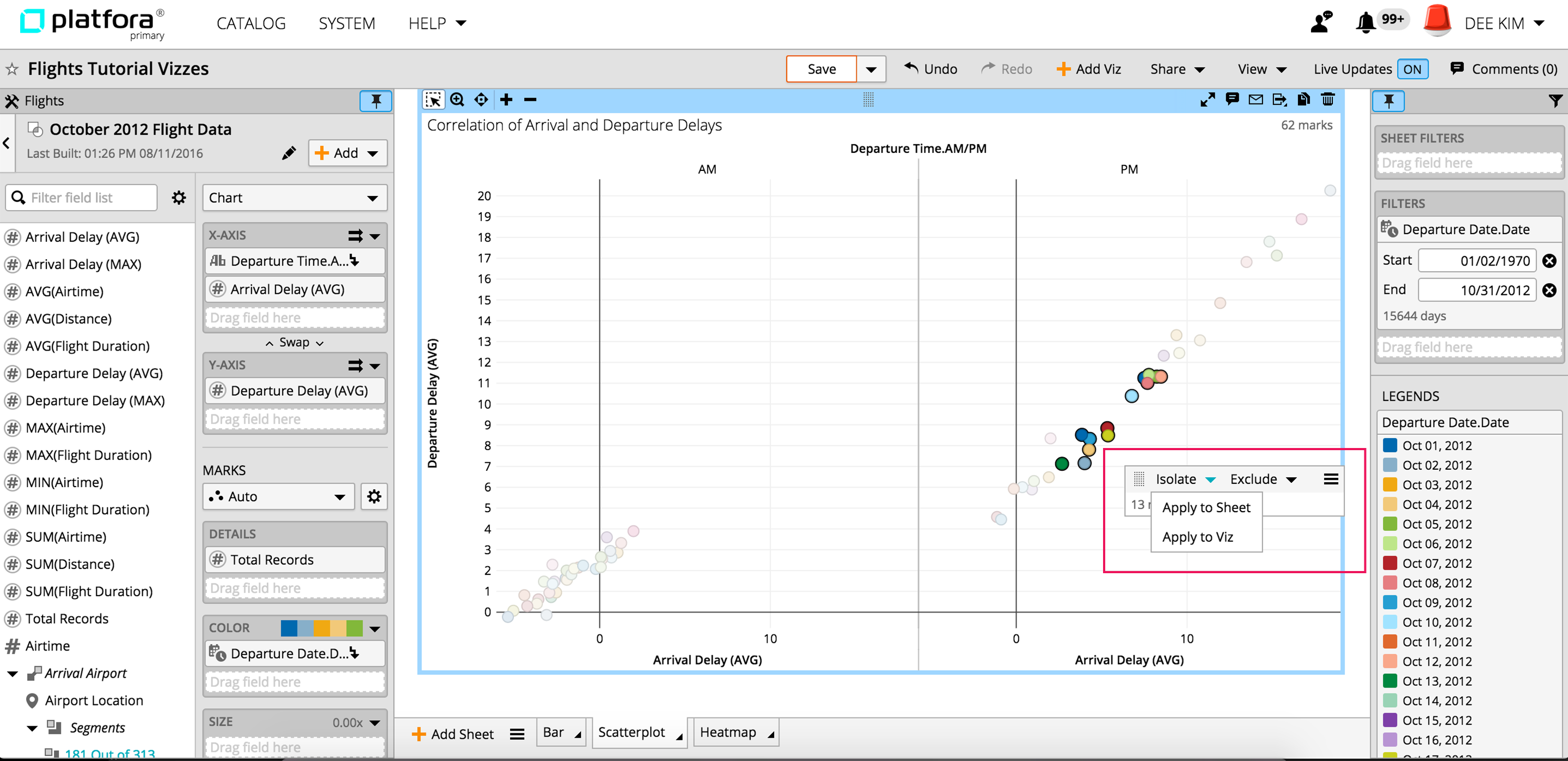
Users usually add multiple filters to clean up data in big data visualization. However, there was no way to switch back to 'no filter' state for comparison. Instead users had to remove applied filters and lose their filter settings.
Our solution? We introduced on/off toggle button where users can quickly shift left and right to have filters removed from displayed visualization.


Interactive Tooltips were redesigned throughout the product to help users understand key metadata and get familiar with data.